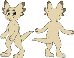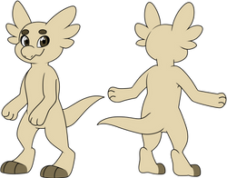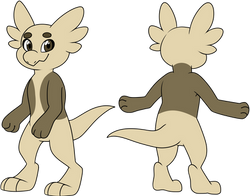
Please note: This page is currently no longer relevant and existed when Wyngro was a actively run community for artists!
It exists as an old space you can visit, but no longer functions in the same way. Thank you for understanding.
Placements Guide
Welcome to the Placements guide! Here you can learn how to make acceptable placements when color upgrading your wyngro!
What exactly IS a placement? How does it differ from a marking, stamp, or tattoo?
A placement is a large surface that overlaps your wyngro's base color. They are basically just different sections of color on your character, and can come in all sorts of shapes and sizes. They are always displayed beneath any markings, stamps or tattoos. Placements can cover separate upgrades / extensions of the body as well, such a shells, wings, horns, etc.
Important things to remember:
-
This is merely a guide, which means not everything is cut and dry! There will be some wiggle room allowed and even case-by-case instances!
-
Placements must still abide by the Color Mixer rules found on the Colors Page.
-
Remember that placements must have a smooth surface, not be complex in design, and take up a significant portion of the body. Edges should be smooth, avoiding sharp or wavy patterns, and not overlap in a way that creates thin strips or creases.
-
You are NOT limited to ONLY these placements! This is a collection of what is commonly seen. If you come up with a placement that's not listed here, that's okay! Just please make sure your placements follow the guidelines.
-
Placements that are found on the Wyngling MYO are acceptable by default.
Official Placement Ideas
Can't think of some good placements for your wyngro? We've got you covered! Below are some great ideas to getting started!
These placements are all considered acceptable within our official guidelines. Please note that if the following placements are altered too much or combined with other placements, there is no guarantee they will be acceptable. If you wish to see a larger version of the image, simply click on it!
 Wipe |  Undertail |  Tumtum |
|---|---|---|
 Swirly |  Shield |  Scrunge |
 Phantom |  Masquerade |  Nubs and Nibs |
 Nubs |  Nubs and Nebs |  Dunked |
 Just the tips |  Nebs and Nibs |  Nibs |
 Nebs |  Narrow |  Kisser |
 Homer |  Gaurd |  Eye Shadow |
 Glare |  Facial |  Cap |
 Dipped Arms |  Bingus |  Yeehaw |
 Wrapper |  Turtleneck |  Triceps |
 Topper |  Tootheache |  Toes |
 Swimsuit Edition |  Double Stockings |  Spats |
 Socks |  Sneaky Beaky |  Double Sleeves |
 Skull Cap |  Skid Mark |  Sinful |
 Shirt |  Saddle |  Rug |
 Quill Wannabe |  Butt Stompers |  Poncho |
 Pants |  Overalls |  Opposites Attract |
 Dunked Arms |  Nose to Tail |  Mock Turtle |
 Mitts |  Long johns |  Knee Highs |
 Invested |  Nosey |  Gauntlets |
 Front to Back |  Full Belly |  Front Cover |
 Foxy |  Fisherman |  Executioner |
 Fingers |  Fingerless |  Earmuffs |
 Diving Suit |  Divider |  Dirty Hands |
 Dirty Feet |  Coated |  Cropper |
 Chinstrap |  Cheeky |  Bodysuit |
 Belted |  Full Tum |  Tum Tuck |
 Bandanna |  Atomic Wedgie |  Mask |
Dos and Don'ts - Visual examples!
Having trouble learning what's acceptable and what's not? We're here to help! See below some examples of what will be denied, and how to tinker that design in order to be acceptable!

This fella's placements have a bubbly edge to them, giving it a fun, goopy look! Unfortunately those edges must be smooth! Let's clean up that shirt.

Nice! All smoothed out and ready to go out on the town!
As you can see, the bottom of the "shirt" is still a little uneven, giving it a very vague wave to it-- this is OK!

This one has some placements that are almost touching, or half-touching one another. It causes a thin strip or sharp edge of base color to appear, which is what we want to avoid.

An easy way to make this passable is to slam those placements right up against each other! This closes that odd gap and makes it all cozy together.
Even though some parts of the placements are touching and look "cut-off", they're separated by limbs or different parts of the body. Therefor, they'd look find isolated on their own!

Here's another example of placements overlapping in a way that creates thin strips.
While it's clear these aren't exactly pinstripes, we want to avoid these thin patterns appearing from overlapping placements.

In order to get that desired look, we isolated the two placements on the lower head and the belly to really separate them so they look fine on their own.
The placements on the knees were done in a similar way. Basically just removing that thin strip caused by the overlap.

Whoa nelly!
This is a cool design, but it's got a lot of things that need addressing.
Some placements (such as the medium red on the head) would not work on its own, for example.
There are also placements that are cut in half, and come to sharp points.
We also need to make sure that placements don't come together to make thin gaps.

That's more like it!
There are still plenty of placements that are overlapping, but in a way that would generally look OK on their own.
Edges have been smoothed out, and each placement is its own color.
It's ready to be approved!
But how do you achieve gradients without cutting the placement in half?
Adding Gradient Between placements:
In order to add a gradient between this placement on the belly, for example, we simply isolated these colors into two different sections on the body. That way, they look fine on their own, but still touch each other for a gradient later on. You can see how this was achieved on the last image! So when setting up placements for a gradient, just make sure that each placement would be acceptable if it were seen all by itself!


Tipping Tips:
Although most placements must be large enough to cover a significant surface on your wyngro, you can "tip" most surfaces as well! These include things like fingers, ears, tail tips, edges of feathers on wings, horns, etc.
Just make sure that tipping a surface does not create a band or pinstripe when laid on top of other placements!
Disclaimer on placements vs. anatomy:
Please keep in mind that all artists have different styles when it comes to anatomy and placements. We moderate placements dependent on what it looks like on each drawing separately. What this means is that a design might look passable in one artist's style, but not in another's.
For example, a placement located on the knees might look fine, but only if an artist draws the knees large enough to make that surface take up a large space. Where as another artist might draw the feet very long and leave the knees almost non-existent.
Each design must consider placement size based on the artist's use of anatomy and style, so do the best you can to utilize these guides for your own unique style. As always, we're happy to help in our #legality_help channel in Discord!


